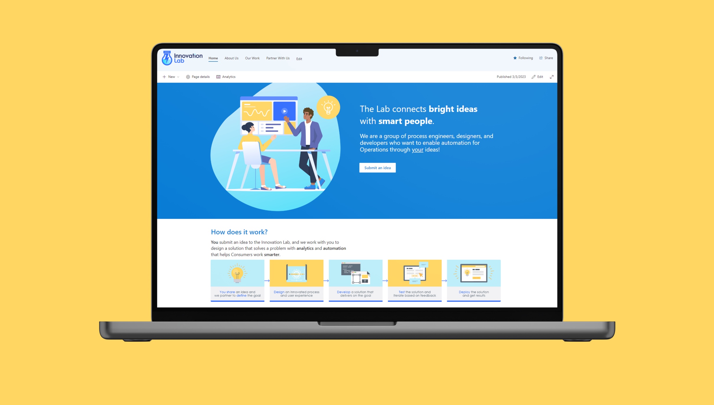
Standard Work App
UX Research UX Design Product Design UI Javascript App DevelopmentSummary
In 2019, my role was to support the standardization of processes to gain efficiencies. One of the gaps I identified was the ability for crews and engineers to access their needed manual or procedure in less than 10 minutes. With the thousands of work orders being completed each day, this time waste added up quickly
The more I researched and scratched at the problem, I recognized it was threefold.
- Document management — There were multiple systems and processes for managing procedures and each had gaps
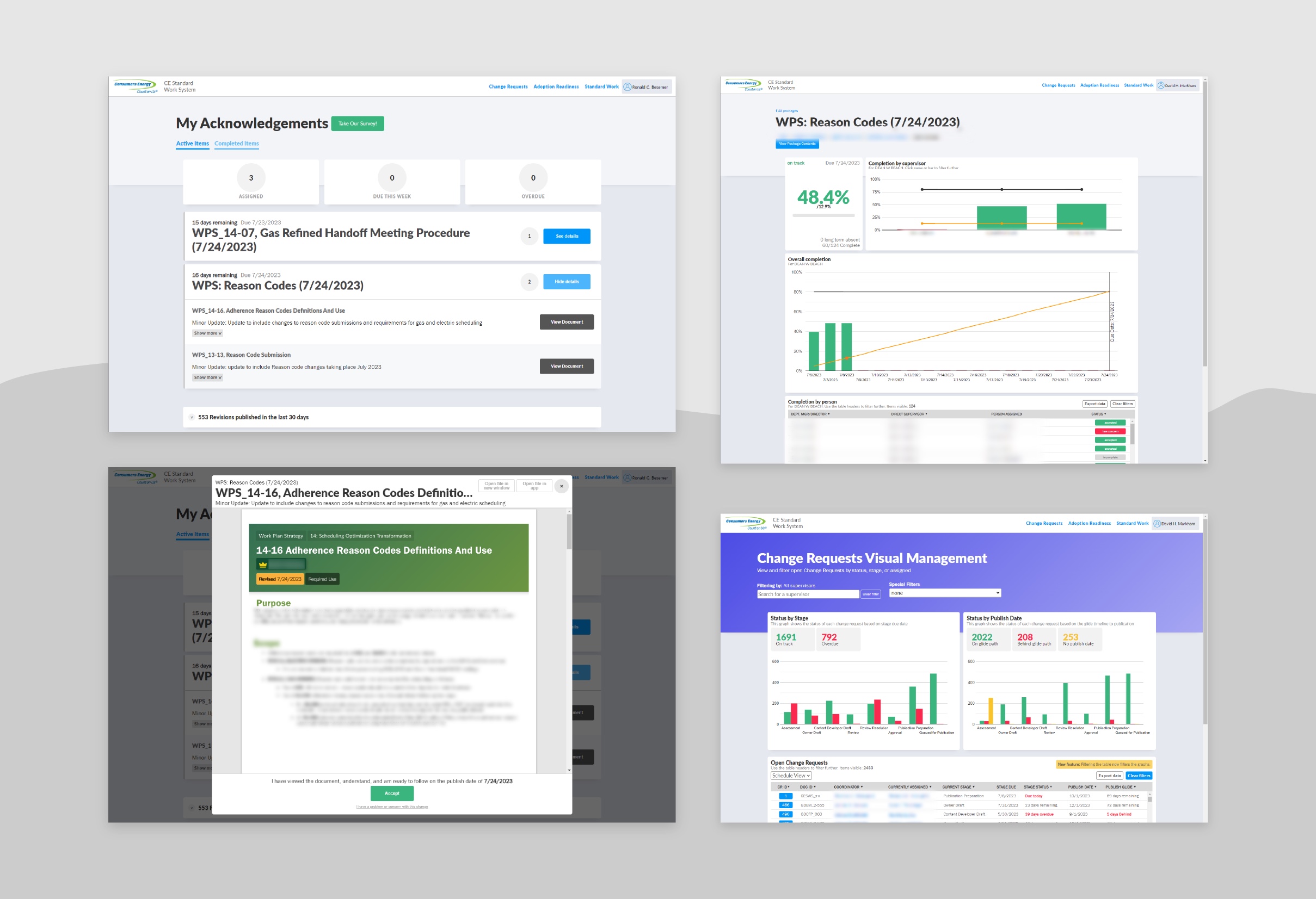
- Communication and acknowledgement — When a procedure changed there was no log of the change nor record that someone was ready to follow it
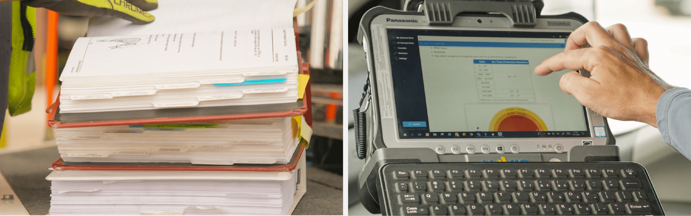
- Accessibility — The storage of procedures was basically messy PDFs in unreliable server folders
These issues and inefficiencies led to only 18% of the 4,000+ users having a positive user experience.
Approach
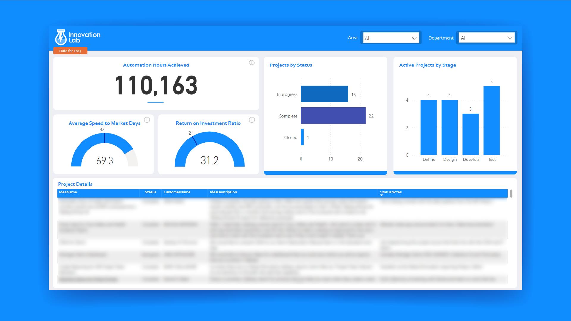
Based on the identified gaps, and their measured impact, I shared my findings with my director and brought a plan. I told her I could create a platform that would close these gaps and save an estimated 4 million dollars over the course of 2 years.
She gave me the green light and we began work. I was the sole application developer/UX Architect partnered with another Power Platform developer who handled the document management process. In less than 6 months we were ready for our first deployment.
Results
The product had planned roll-outs to different areas of the company, but even after v1 we delivered on closing the three major gaps.
- Document management — A single system for document management was created, eliminating 15+ other systems and avoiding purchasing new software.
- Communication and acknowledgement — I created a system where employees expected to perform work were notified ahead of the procedure changing and required to acknowledge the receipt, garnering 2 million records in just a year.
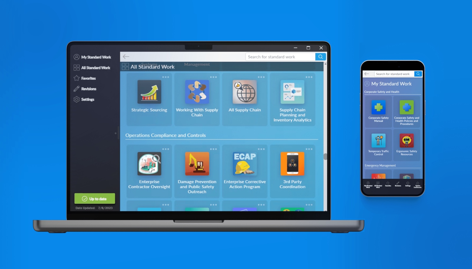
- Accessibility — I created an desktop app and an online portal which gained over 10 million visits in 2 years.
With these solutions in place, user experience score increased from 18% positive to 88% positive within 2 months of implementation.
My Role
To actually be able to solve the problem effectively and sustainably, I had to take on multiple roles at the same time during the course of the project.
- UX Design — research, observation, experience mapping, feature prioritization/consolidation, field testing
- App Developer — JavaScript, HTML/CSS, Rest APIs, SharePoint backend, node.js
- Implementation Lead — Communication, marketing, executive pitching, training webinars, video creation
Scope
Developing the app was only part of the holistic solution. Here is a summary of assets and features I developed as part of the solution.
- Desktop and web application
- Full text search with sorting algorithm and stemming
- Automated tool to build search indexes
- Tool to convert Microsoft Word Documents to HTML files for the app to use
- Real time dashboards for: Tasks and acknowledgements with visualized graphs to show system health and performance overall
- REST API method for detecting newer versions of files and saving to the local device
- User database, including cloud-stored favorites, history, and settings
- Definitely more things I'm forgetting
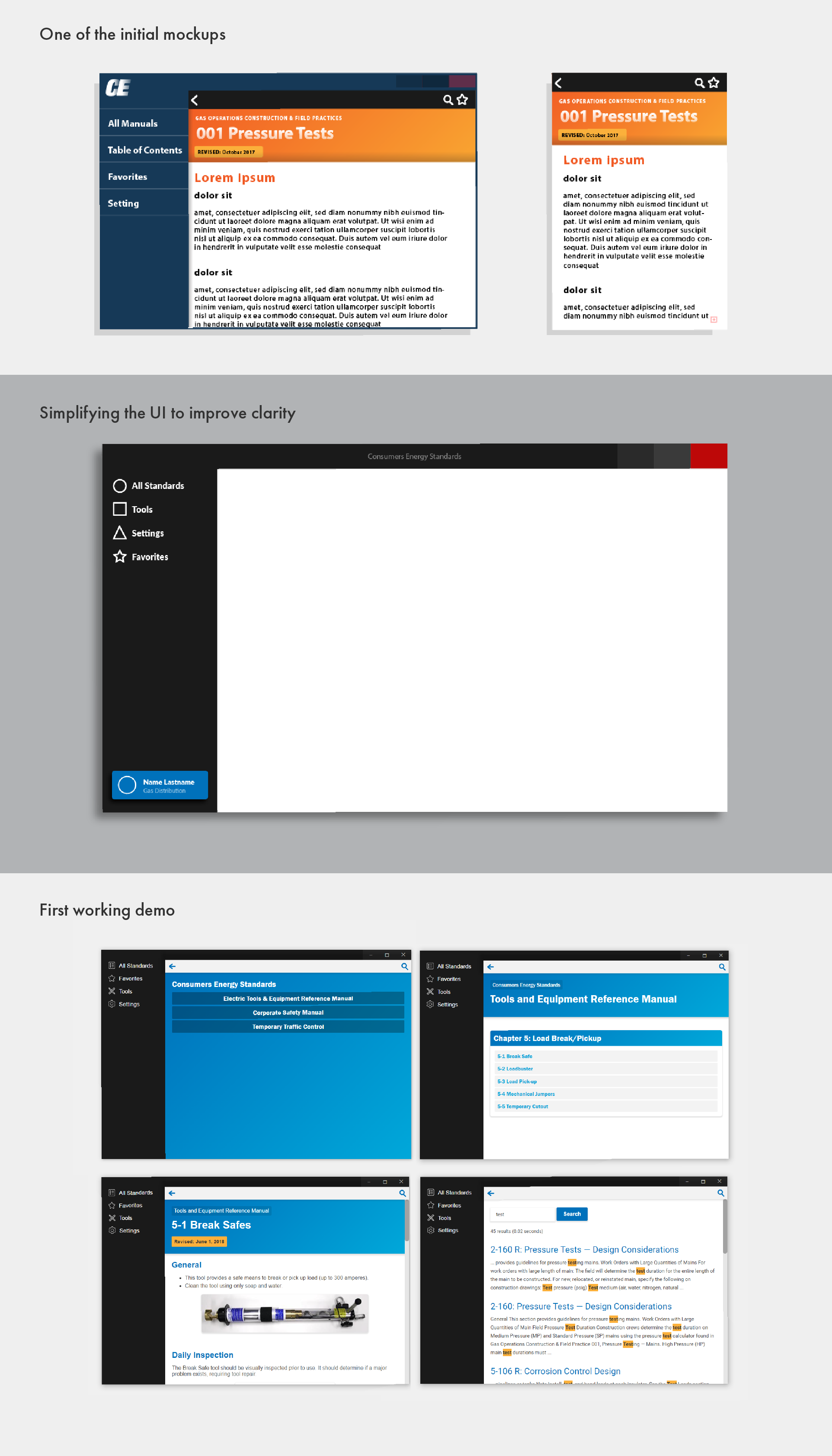
UX Process
There is so much I can say about the effort that went into this application as well as the impact it had, but I wanted to highlight the process I used to nail the User Experience design and how every ounce of effort paid off in the long run.
Identifying the Problem
- Started with a hypothesis of the problem
- Performed field visits and job shadows to observe and refine the problem
- Surveyed 500 users about their current experience across key categories
- Refined problem statement and categorized areas of impact
Designing the Solution
- Created initial sketches, wireframe and mockups
- Tested with micro focus groups (small 10 minute sessions)
- Refined mockups, tested on actual devices in use
- Pitched mockup to key stakeholders
Developing and Testing the Product
- Built a working prototype
- Tested prototype with real lineworkers
- Used that feedback to refine requirements
- Developed and tested (so many micro iterations!)
- Confirmed all in-scope features were complete
- Released a real-world pilot to 40 users
- Measured success of pilot with the same questions from the initial survey and saw improvements in every category
- Final adjustments based on feedback from pilot
Deployed!
Fleet Mileage App & Reporting
UX Design UI Lean processes Javascript App DevelopmentSummary
Michigan's largest utility was running their company vehicle program completely through paper mileage forms that were emailed (or even faxed — yes, faxed, even in 2022) and then placed into an Access file.
This created a couple problems for several groups:
- Program enrollees — managing paper records as a nightmare and a huge waste of time
- Program administrators — mileage records were received in a variety of formats, lots of manual data input, no insight into program health
- Finance — inconsistent accuracy of mileage records, no strong grasp on cost
All this led us to creating an application to collect and visualize mileage data, build a relational database for trip logs, and create a suite of visualization dashboards to view the records and impact in real time.
Solution and Results
- Modernized app for mileage entry — rolled out in phases across different ares of the company, eliminating over 50,000 paper trip logs per month
- Dashboards for all system data — Finally program administrators had real time insight to mileage trends and gaps in trip logging
- Spend and return on investment records — By collecting and visualizing the data, we were also able to generate an actual ROI for the vehicle program, exposing where overspend was occurring
With these solutions in place, we saved over 10,000 hours of human struggle ($500k~) between the three user groups.
Additionally, by adding the automated calculation for the Return on Investment (ROI), we helped show that the fleet program was actually more expensive than traditional mileage reimbursement and that there is $2-4 million in savings if the program was restructured.

UX Process
This app was seemingly simple when it first came up. However, there were a couple key assumptions that had to be corrected before the team really caught our stride and finished the product.
Challenging assumptions
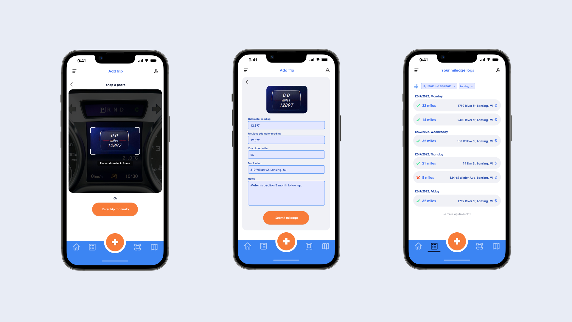
- Users only need to be able to enter miles and view trips — Through interviews and wireframe tests, it turns out users also wanted to be able to grab recent addresses, snap photos of their odometers and check approval status of trips.
- Visualization just needed to show participant adherence — When observing the process, there were also monthly, quarterly and as-needed data analysis that was being done that could be addressed with relevant filters on the dashboard. Additionally, the ability to automatically calculate the ROI for the program/period would add so much value to the evaluation of the program.
Design and redesign
- Homepage — Being dropped into the app on an add trip form was unhelpful and users who had multiple trips in a day or week didn't have an overview of their weekly activity. I redesigned the homepage to be more human-centered which helped orient the user to whatever their next task was.
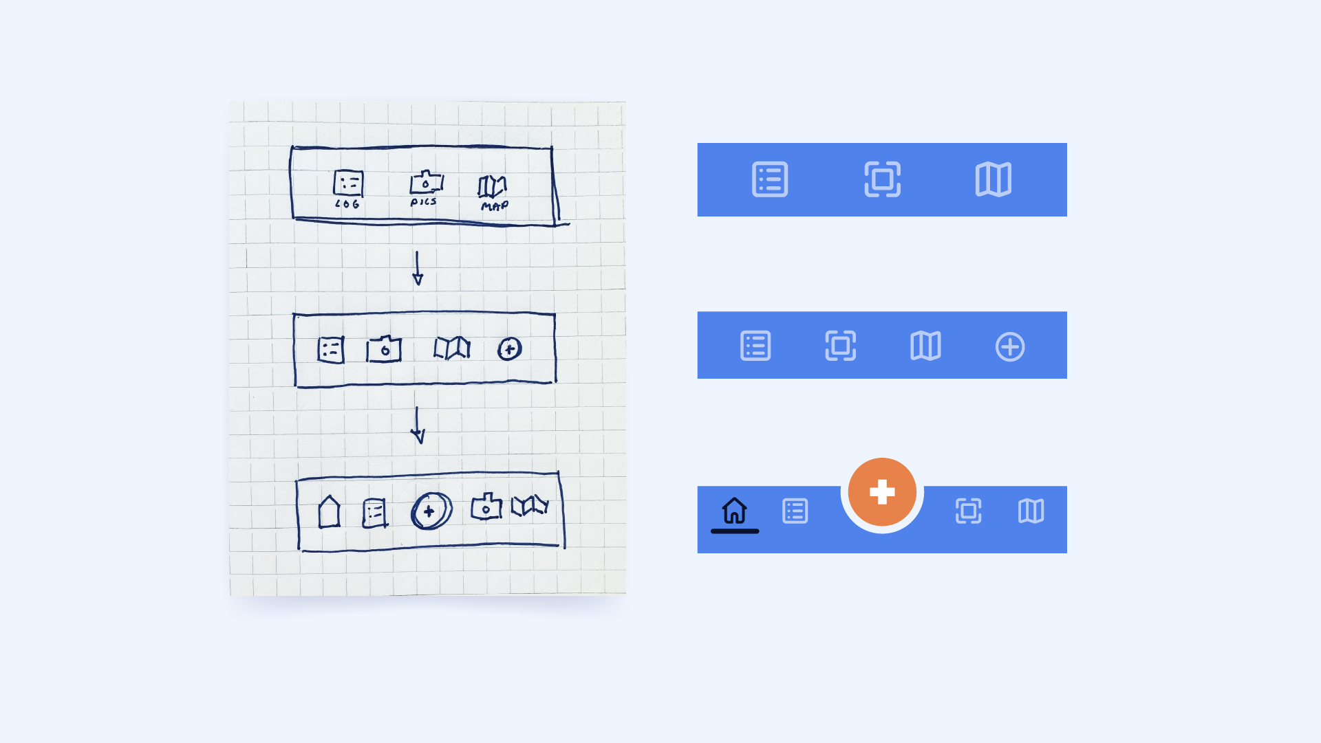
- Navigation — Based on several iterations of A/B tests, we landed on a final design for the navigation bar that spotlights adding a trip as the primary function.
- Trip log flow — Originally, the flow for adding a trip was Launch app → Trips → Add trip. The updated navigation enabled users to get to the add trip immediately after launch, and we furthered simplified by working with the developer to be able to snap a photo and automatically read the odometer.
Bonus sketches — take a look at some of the original navigation layouts.
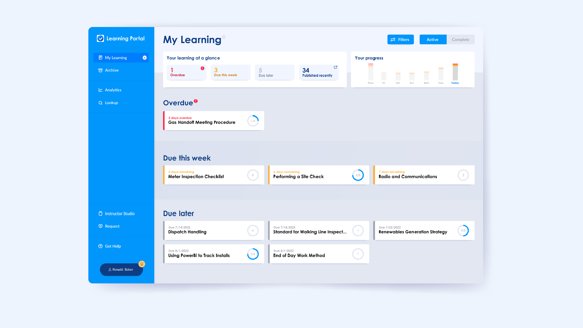
Learning Portal
UX Research UX Design Product Design UI Javascript App DevelopmentSummary
In 2020, I had finished designing a product for finding and viewing manuals and procedures. Now that the issue of locating the right document was solved, I switched gears to designing a Learning Portal with 3 priorities:
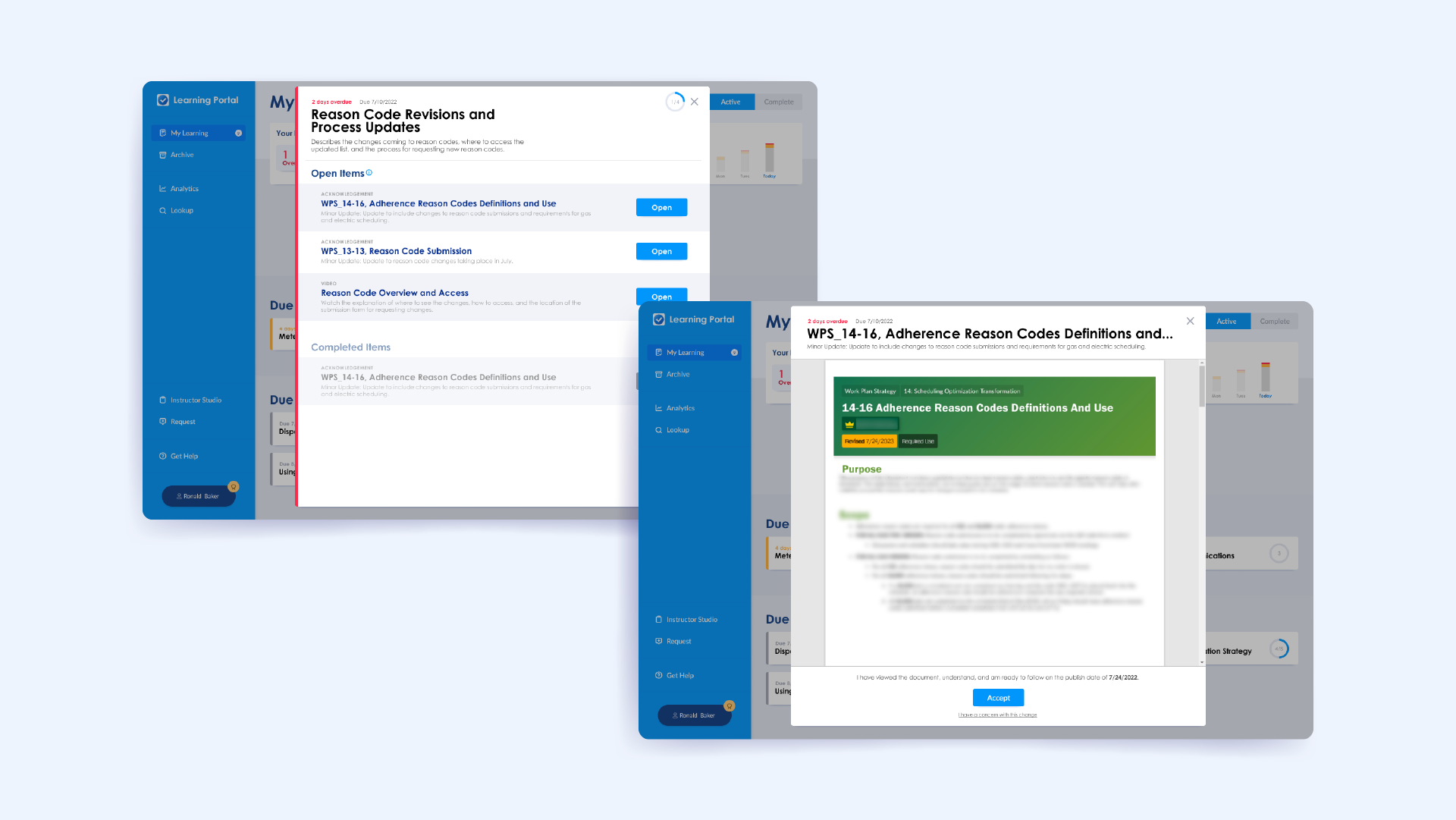
- Communication and training on changing procedures — Any time a required-use procedure was changed, there was no standard method of rolling out the communication or training.
- Record keeping of individual receipt and acknowledgement — When training was required, there was no universal way to keep track of who completed it (which is required for compliance to Michigan state regulations).
- Standardization and streamlining of learning creation — Every time training was required, there was no standard method or format for creating communication or learning packages.
My Role
For this effort, my role was full stack product designer. This meant I was responsible for:
- UX Design — research, observation, experience mapping, user flow diagramming, feature prioritization/consolidation, field testing
- UI Design — building component building-blocks and libraries, animating components, testing interactions, and managing the design system.
- App Developer — JavaScript, HTML/CSS, Rest APIs, SharePoint backend, node.js
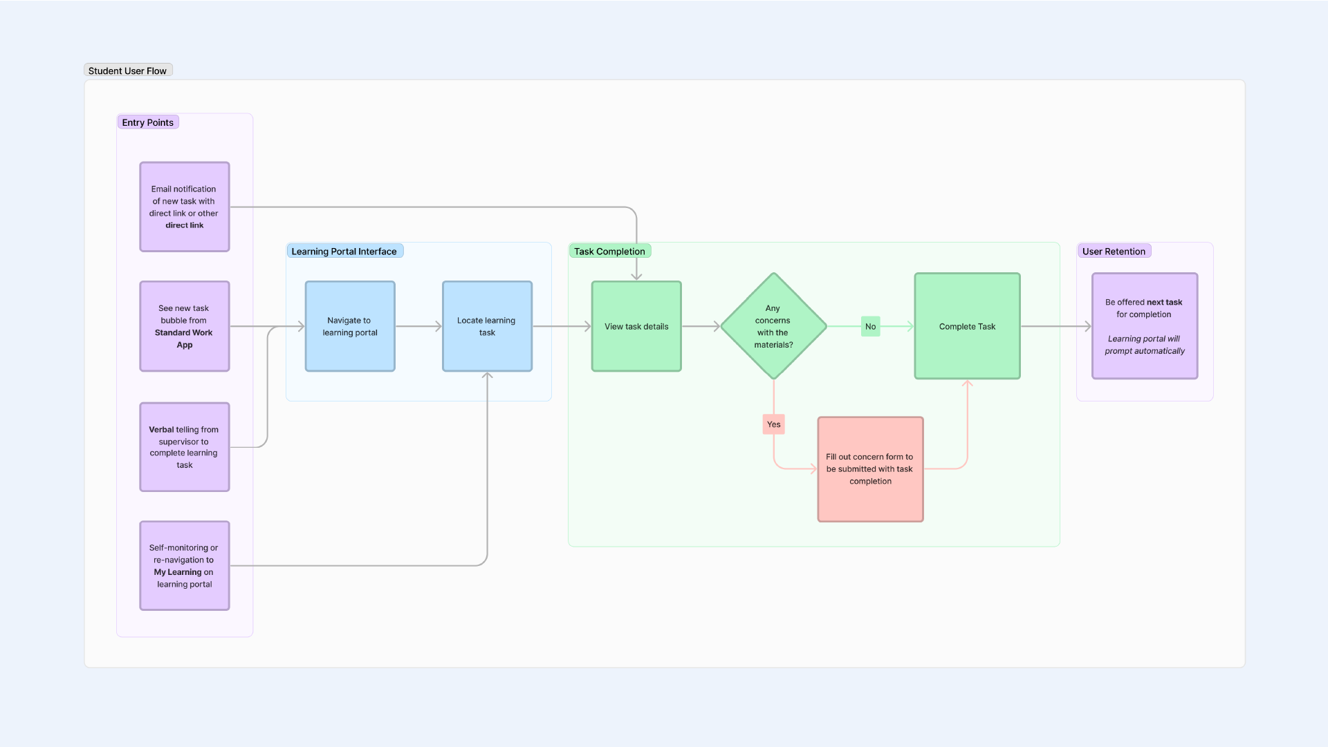
User Experience Approach
To make sure that I wasn't pursing a partial solution, I wanted to confirm the product goals. To do this, I interviewed key-stakeholders, surveyed user groups, led priority mapping workshops, and identified gaps against written regulations.
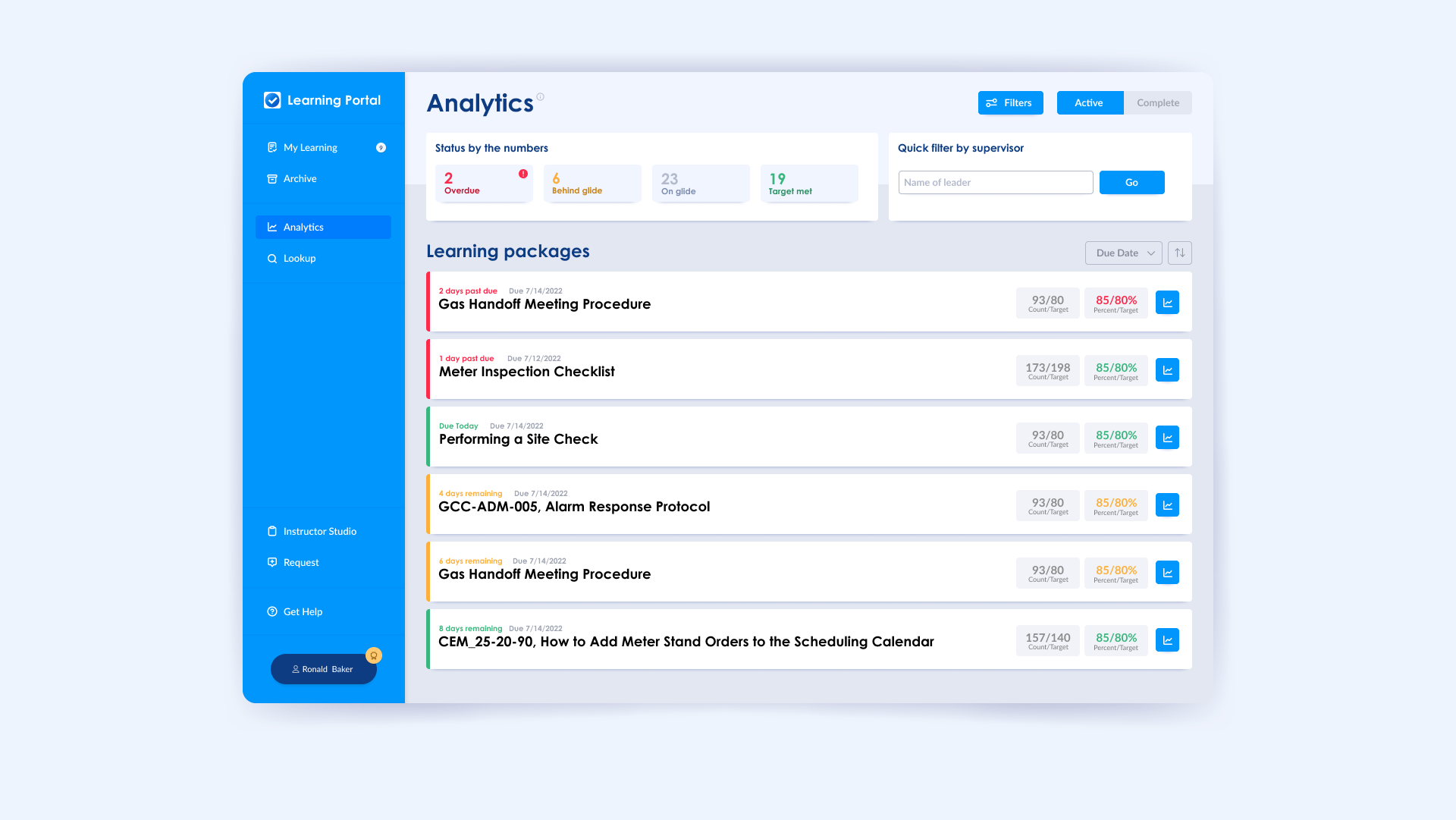
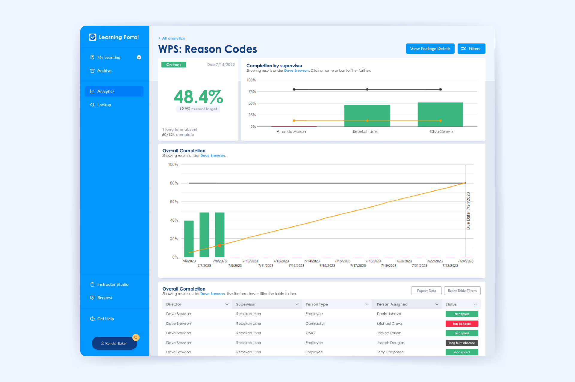
These product goals also became the KPIs for tracking product success and identifying areas user experience could be improved in the future.
Product Goals
- Learning packages that would be required are created
- Learning packages are assigned to all people with appropriate roles
- Learning packages are communicated to those required to complete it
- Learning packages are completed on time
- Learning concerns have an avenue to be shared and addressed
- Learning packages can be tracked without the need of separate systems or tools
Once I understood the product goals and priorities, I used that to develop user personas based on who would be using the product and what their goals were.
Personas
- Assignee — I want to be notified about tasks, view tasks, submit concerns for tasks, and complete tasks.
- Leader — I want to be notified of, track what my employees have been assigned, and manually update an employees status if they are on a long term absence.
- Facilitator — I want to easily create training packages, see and address any concerns, and track any learnings I own.
- Monitor — I want to see the status of key learning objectives for specific organizations and be able to follow up where needed.
The data-driven approach, KPIs, and personas gave me the rubric to design and develop against.
Results
Remember those product goals I worked to define? We used those as metrics to keep track of areas where we needed to improve the user experience and measure success. Here are some highlights.
- Over 900 Learning packages created in the first year.
- 100% integration with document management and notification systems
- Over 10,000 unique users completed tasks within the first year
- Over 2,000,000 training items completed within the first year
- 86% positive user rating from in-process surveys
Lessons Learned
This product is one I am particularly proud of. It combines a needed service with real data insights to create a user-centered platform that solves a real business problem. And if that sounds like a a string of buzzwords, I get it — but it is true.
For me, what made this project so successful was stepping back, grouping similar user flows, and narrowing the goals to as fine a point as possible. It was tempting to add more nuance (like whether the assignee was an engineer or if they were a field worker or if they were a compliance representative).
But it turned out that those dimensions didn't change the fundamental goals or desired user flows. By relying on my research, I was able to design a product that met those goals in an elegant way that made complex tasks as simple as possible.
Innovation Lab Branding
Branding Graphic Design Web Design SharePointSummary
As manager of the Innovation Lab, one of the first tasks I took on was establishing an internal brand to help bring credibility to the team's capabilities through a cohesive yet flexible visual identity.
While designing a logo and visual identity was far outside the expectations of my role, it was a fun way to engage my graphic design roots while creating something for my team to rally around.

Visuals
The logo itself is a clever combination of a lab beaker, a lightbulb and a lightning bolt — a perfect representation of how the team fit into the context of the industry!
The combination of custom visuals and colors along with some tweaked stock illustration gave the group a decent baseline of assets to leverage for digital products that
Results
Branding aside, under my leadership the team was able to accomplish some incredible things, including deploying digital products that saved our coworkers over 100,000 hours of human struggle.
Eras Bingo
For Fun Web Design Web Development UI Interaction DesignSummary
For my sister's 22nd birthday we hosted a Taylor Swift themed party to celebrate! Along with costumes, karaoke and themed snacks, no party would be complete without a game!
I made this web app that uses a shuffled Spotify playlist as the song picker, and players can tap the spaces off as they go.
Temporary Traffic Control App
Development UI Interaction Design UX DesignSummary
Temporary traffic control plans are used any time work is being done on or near a roadway. The Michigan Department of Transportation has requirements on what plans should be used in certain circumstances. There are twenty-some plans that can be chosen from, so making sure you have the right plan selected can be a challenge.
The backbone of the application is a decision tree that will lead users to the correct answer 100% of the time within 6 clicks.
UX Approach
A version of the questionnaire was attempted prior to my involvement, but the logic used caused some paths to be up to 13 questions deep.
To help make sure we got the simplest approach with the best user experience for crews, here is the approach I took:
- Affinity map plans to group based on high-level branches
- Create and refine decision tree
- Validate criteria against MDOT requirements
- Prototype and test with field crews
- Deploy and iterate!

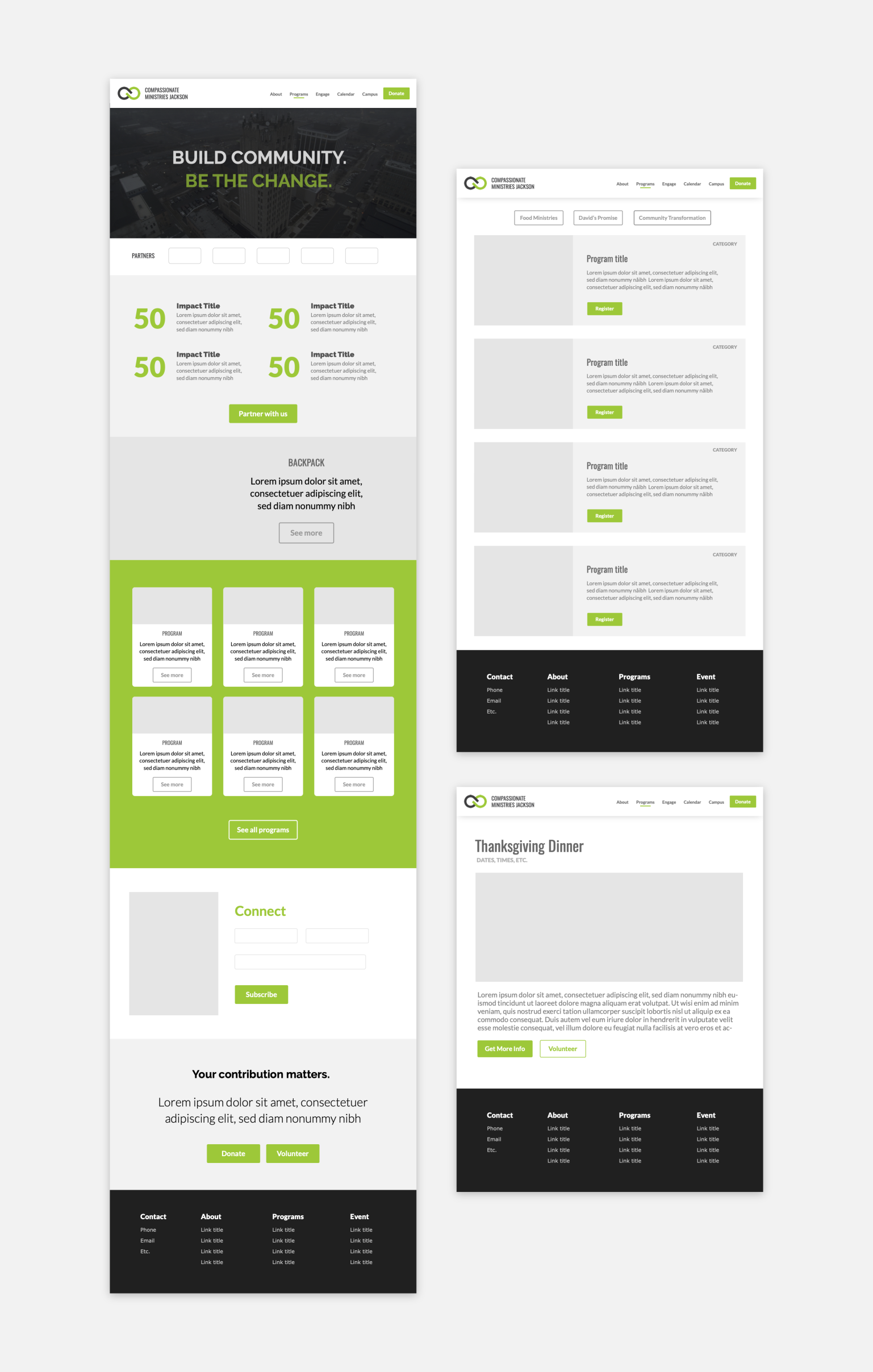
Misc websites
Non Profit Web Design Branding Web DevelopmentSummary
Here are a few mockups skeleton mockups created as part of some web development support I did for a few nonprofits. These served as the groundwork for what I later developed for them.

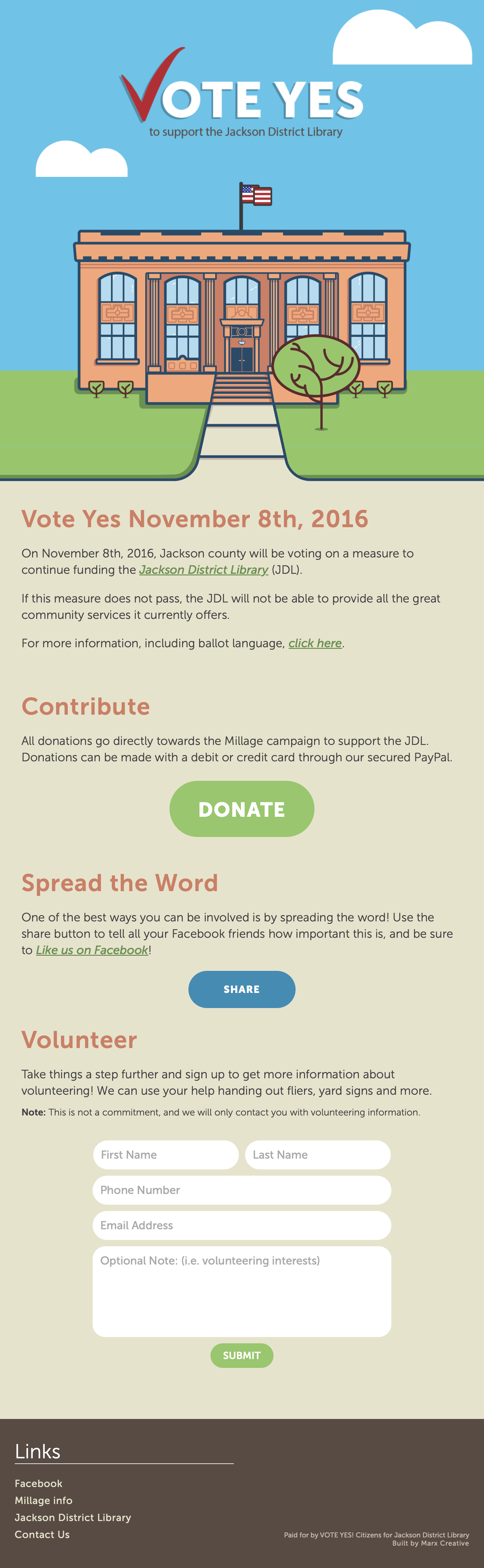
Library Millage Website
Non Profit Web Design Illustration Web DevelopmentSummary
Vote Yes JDL was a campaign to support a millage that would increase funding for district libraries.
The Citizens for District Libraries group had no central hub for information regarding the millage, how to share, or where to buy a sign to support.
I created this custom illustration of the library, as well as a custom built site to connect everyone together.
The millage passed!
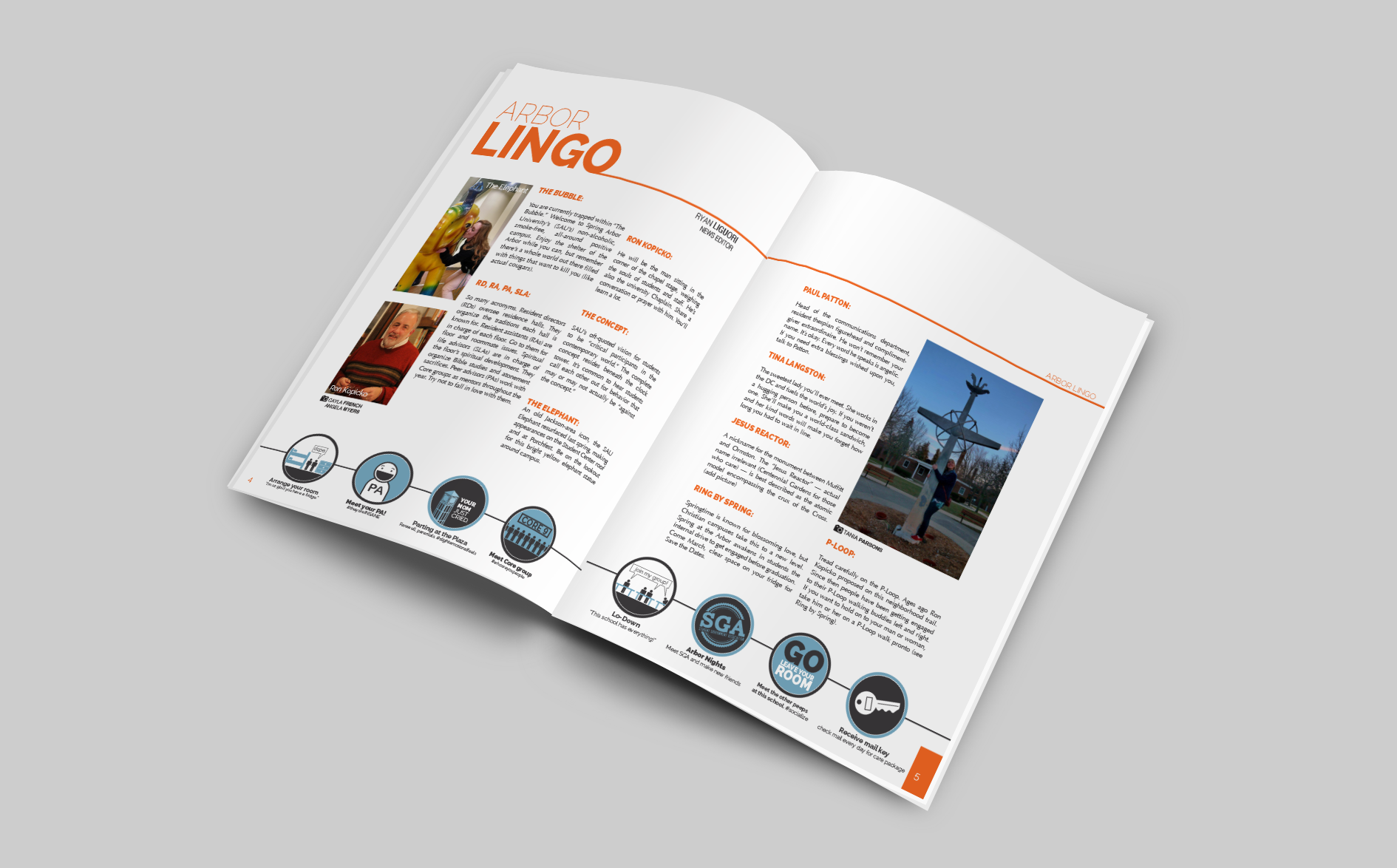
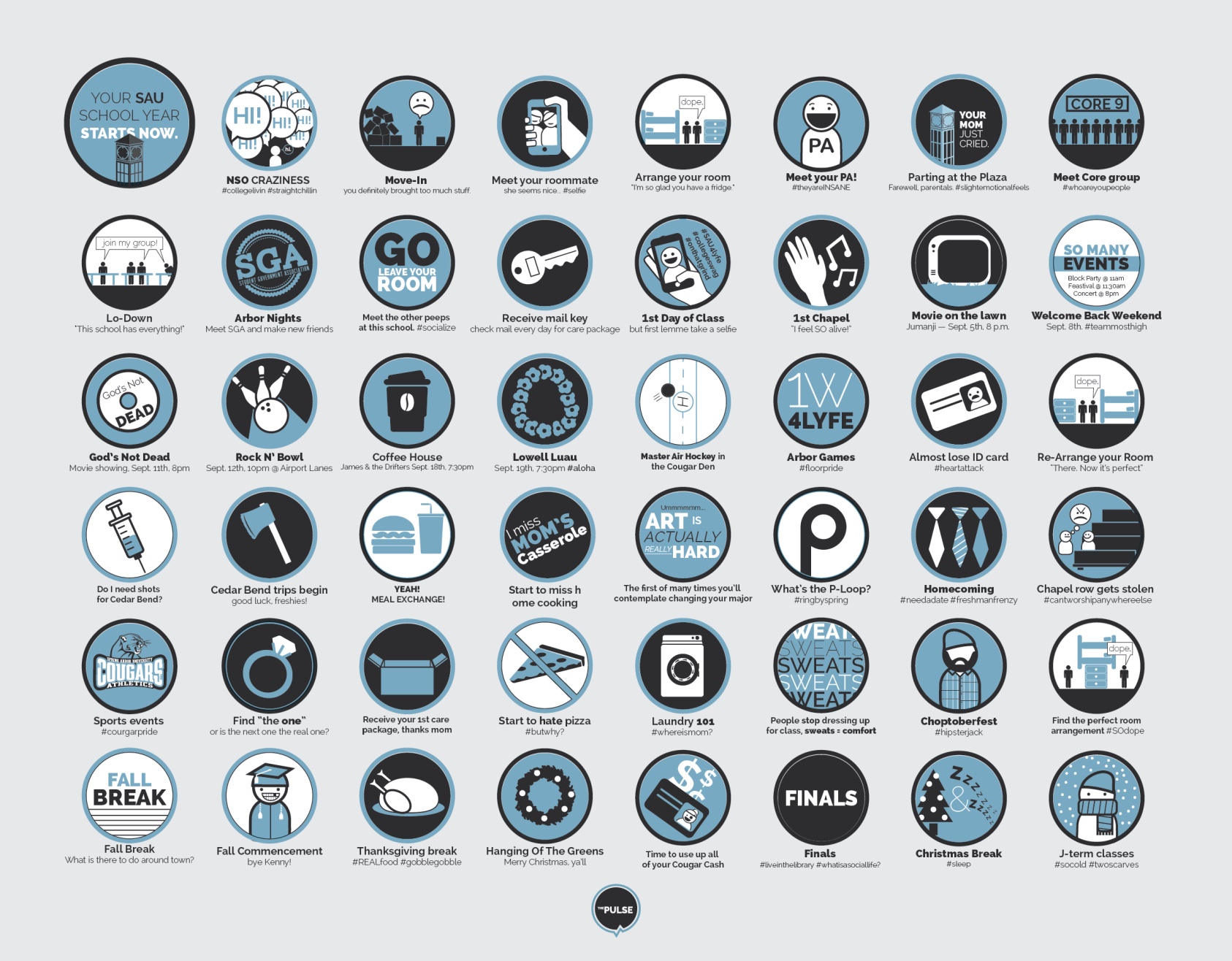
The Pulse Redesign
Branding Graphic Design Print Layout Art DirectionSummary
The Pulse was historically printed black and white in a traditional newspaper format. While the format was classical, the lack of a cohesive and eye-catching design across monthly issues caused the pulse to remain an unnoticed table topper. The mission was to increase readership without increasing workload.
Approach
After focus groups with students and faculty, we identified three main opportunities for improvement to bring life back to the agin paper.
- Drab branding – to keep up with the increasing visual nature of media the branding needed updating
- Outdated physical format – while the newspaper was classic, it wasn't as accessible for the audience as a magazine format
- No online presence – the current layout for articles wasn't conducive for online sharing
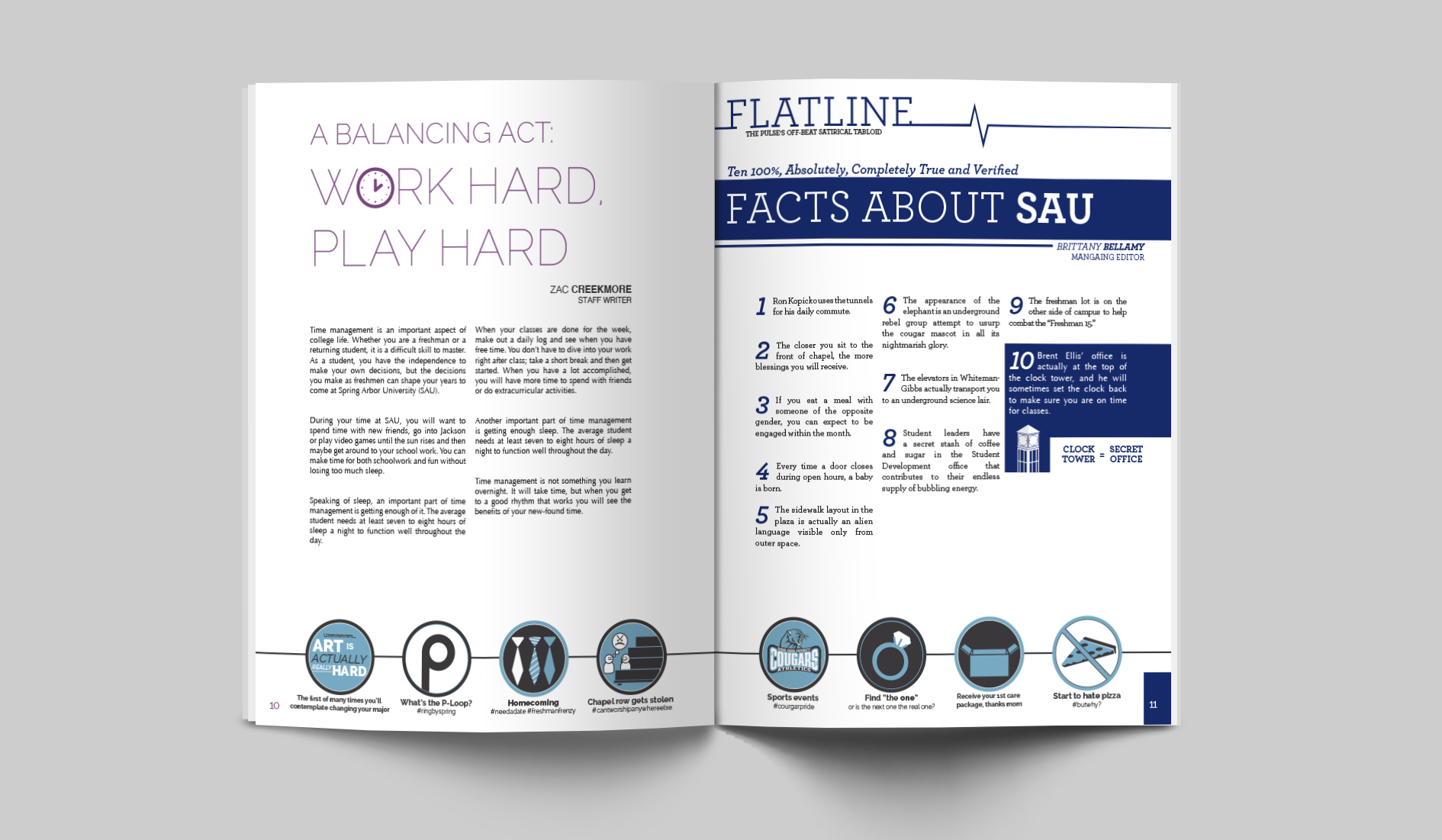
Solution
To meet the needs of the audience, increase readership, and maintain the sustainability of the publication, the solution was two-fold: both process and design needed to be addressed.
- Established process for article submission, review and layout
- Switched to magazine layout
- Re-branded the magazine to match the new format
- Created style guides and master pages to enable faster and higher quality designs
- Released website and social media channels for online publication
Results
- Traffic was now traceable via the online channels
- Readership increased (measured by leftover magazines in stands)
- Time from review to design of article was reduced to < 24